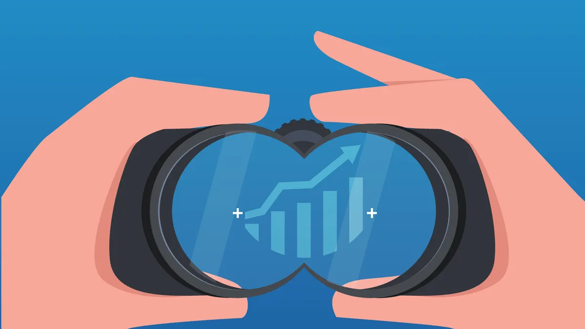
In engineering, the signal-to-noise ratio compares the level of the desired signal to the level of background noise (which obscures the signal). You want the signal (the information). But the noise (background interference)? Not so much. In economics and business, there is lots of data and information, but it's increasingly hard to separate the noise from the signals.
Based on the potentially impactful trends in 2022, we pulled four charts that provide valuable signals for tracking the direction of the U.S. economy.
The Chance of Higher Interest Rates
With the Federal Reserve Open Market Committee now set on raising the Federal Funds rate this year, the only question will be how many times, and at which of the eight FOMC meetings, the target funds rate will change.
Swaps and futures have been a good indicator of interest rate hikes, but digging through raw pricing data is tedious. A more quickly grasped view of the situation comes from the CME Group’s FedWatch tool. Its target rate probabilities graphic (below) shows the market-implied probabilities of Fed Funds target rate ranges based on Fed Funds futures prices.
As of Monday, January 24, there is nearly a 50% probability that the target rate range will be 50-75 basis points after the June FOMC meeting, up from the current 0-25 basis points. That implies two rate hikes in the first six months of 2022. There’s also a 37% chance the target range will be 25 basis points higher than that.
An alternative to the CME’s tool is the Federal Reserve Bank of Atlanta’s market probability tracker. The Atlanta Fed’s version is also highly visual, and the methodology uses a wider set of futures contracts to generate the probabilities.
The Preferred Inflation Gauge
To track the monthly increase (or decrease) in prices consumers and businesses pay for goods and services, the Federal Reserve board prefers the Bureau of Economic Analysis’s (BEA) personal consumption expenditures prices index (PCE) — in particular, the “core” price index that excludes food and energy.
The general feeling (even outside the Fed) seems to be the PCE includes more comprehensive coverage of goods and services than the consumer price index (CPI) does. For example, the PCE measures all the goods and services bought by all U.S. households and nonprofits; the CPI only accounts for urban households, according to investment consulting firm Callan. The PCE also uses data from the gross domestic product report and suppliers, as opposed to the CPI’s household surveys.
The core PCE number (the year-over-year monthly change graphed below) strips out food and energy prices, which can be highly volatile. We like the year-over-year percentage increase numbers because they’re more easily grasped than the month-to-month percentage changes. The St. Louis Federal Reserve has graphs that let you see the country’s periods of high inflation over a longer period.
Employment Trends
Filling job openings and retaining valuable workers is an important job for CFOs in 2022. So, it may help to monitor the health of the labor market to see how the supply of workers might be shifting.
One data point from the Bureau of Labor Statistics (BLS) that we found interesting, especially as the pandemic wore on, was the portion of employed persons who were working part-time for reasons not of their choosing. The BLS calls this “working part-time for economic [or non-economic] reasons” and provides it in Table A-8 of the vast number of tables the BLS produces about people’s employment situations. The “economic reasons” number (graphed below) includes people who have worked 34 hours or fewer due to unfavorable business conditions, inability to find full-time work, or seasonal declines in demand.
As the chart shows, this number surged in April and May of 2020 when pandemic lockdowns closed many businesses; it declined as lockdowns and restrictions eased. Of course, there are plenty of other data points available to get a more holistic view of the ever-changing labor market, including labor force participation, average hourly earnings, self-employed workers (also in A-8), and even business formation statistics (provided by the U.S. Census Bureau).
Consumer Optimism
Any CFO worth their salt knows how vital consumers' outlook is to the U.S. economy. For example, when consumers feel secure in their jobs and thus more optimistic about their own financial outlooks, they tend to spend more.
That’s why the monthly University of Michigan Consumer Sentiment Index (graphed below) is so closely watched. Each month, the university conducts phone interviews (a minimum of 500) of people across the U.S. and collects answers to 50 questions about personal finances, business conditions, and buying conditions. While the headline index number is useful, Michigan’s release also includes data on consumers’ expectations for inflation, prices changes, and household incomes. An economist also provides extensive analsys of the monthly numbers.
While the web is filled with easily accessible data, CFOs should remember that first-hand info can be just as valuable. When we asked Bona Allen, CFO of Kajima Buidling & Design Group, which data he tracks, he noted the value of talking with suppliers.
“Some of our most significant challenges relate to supply chain issues as we source materials, and trade partners/subcontractors, to build our facilities,” Allen said. “Since we are constantly bidding projects around the U.S., those partners are the best source of real time info.”